The brief

For my final year University project I was tasked with creating a digital media artefact, which could take many different forms including (but not limited to) websites, 3D environments, immersive installations, graphic design work, sound, photography, video, animation, games and storytelling.

Ideally, the project we created would tackle a societal or broader issue in some way. To tackle this, I decided to create a graphic and motion design-led social awareness campaign for young carers. Once I'd settled on this idea, the name felt obvious - 'Who Cares?'
The challenge

Young carers rarely self-identify. They often lack the language to describe what they do, and many don't know that support even exists. Any campaign risked either alienating its audience through pity, or failing to reach them through clinical detachment.
The dual-audience problem was the central design challenge: the same materials needed to resonate with a teenager who has never considered themselves a carer, and with a school safeguarding lead who may never have looked hard enough to find one. The tone had to be empathetic without being condescending, honest without being alarming.
The solution

1. BRAND IDENTITY
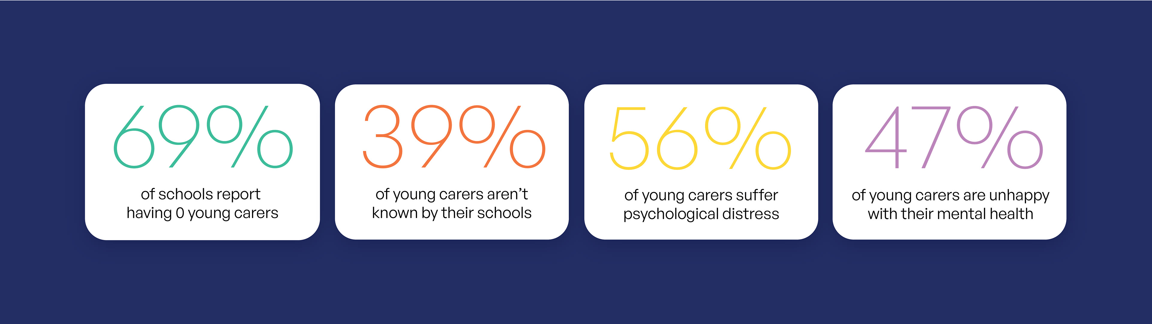
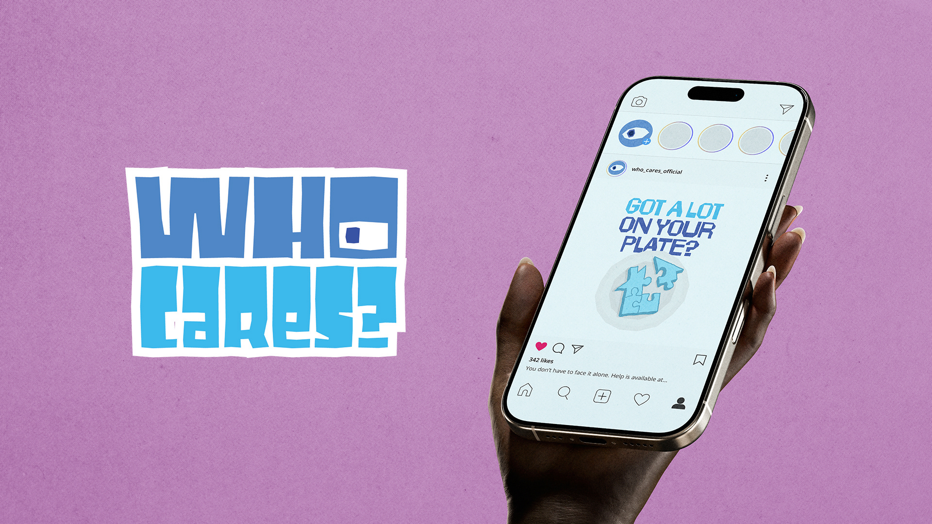
The Who Cares? word mark leads with deliberate ambiguity, serving as a question that could be dismissive or urgent depending on who reads it. The hand-rendered, blocky letterforms give it energy and accessibility without softening the gravity of the subject. A three-shade blue primary palette signals trust and institutional credibility; secondary colours (teal, amber, coral, lilac) punctuate statistics and illustrations without overwhelming.
2. CAMPAIGN STRATEGY
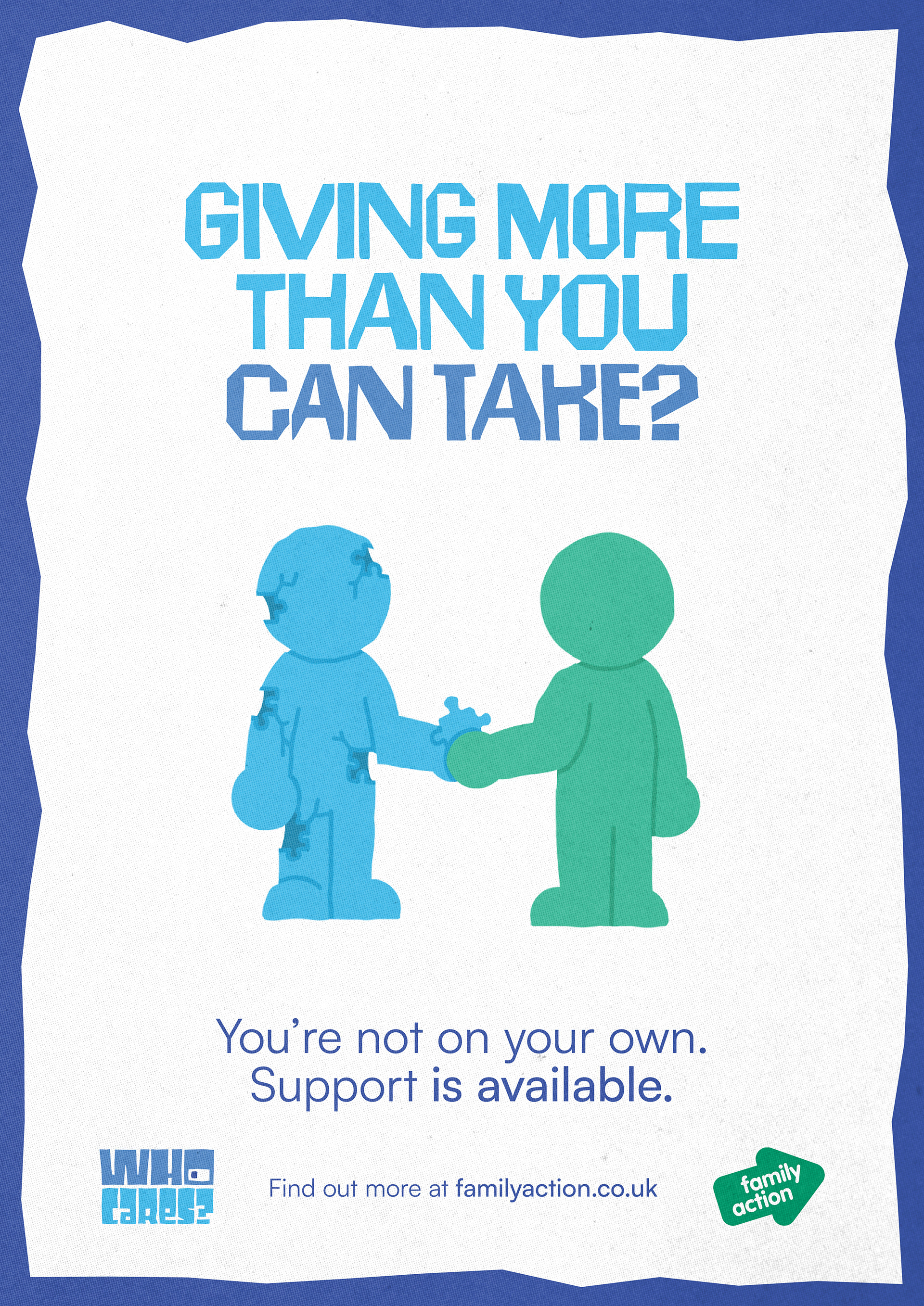
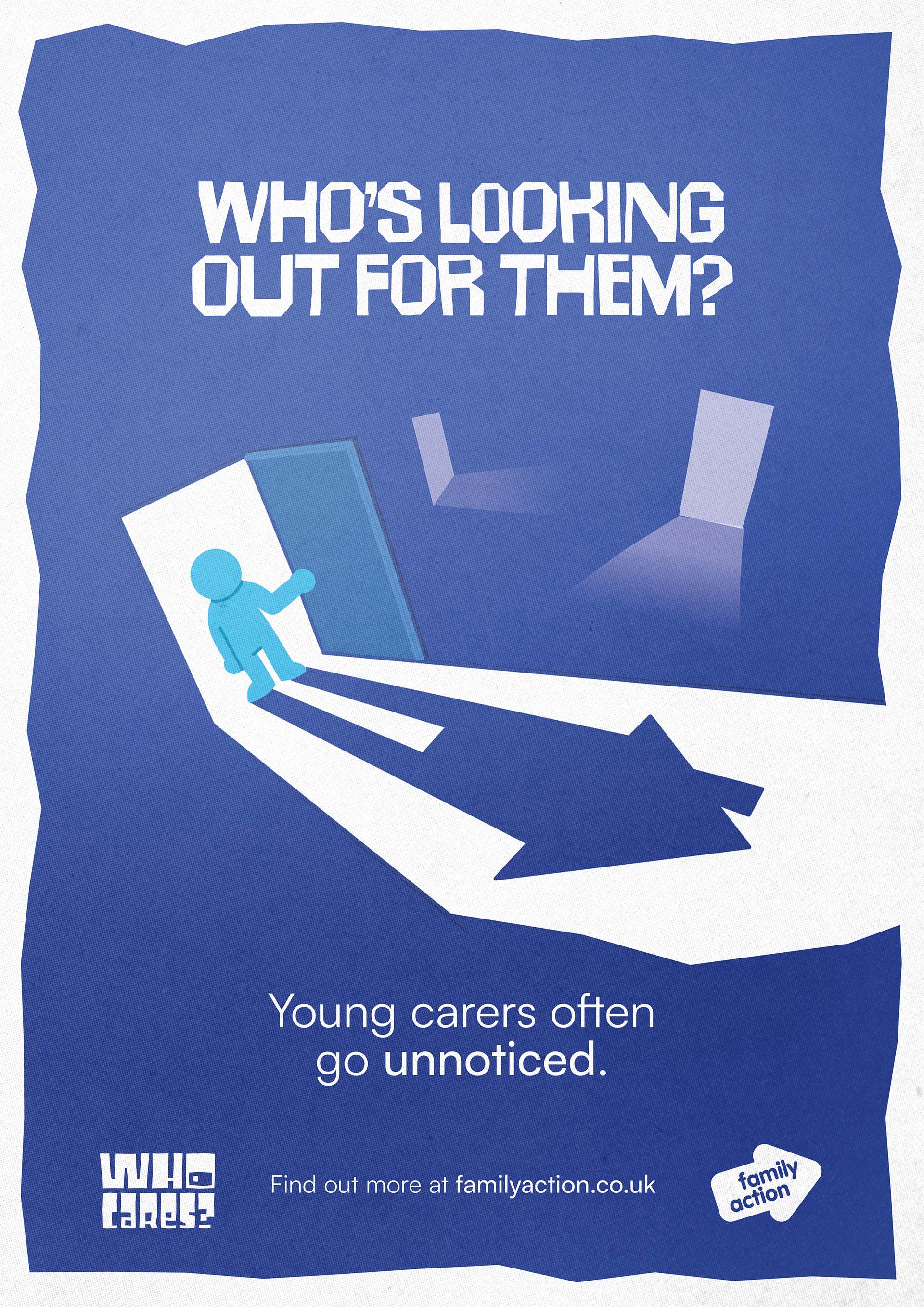
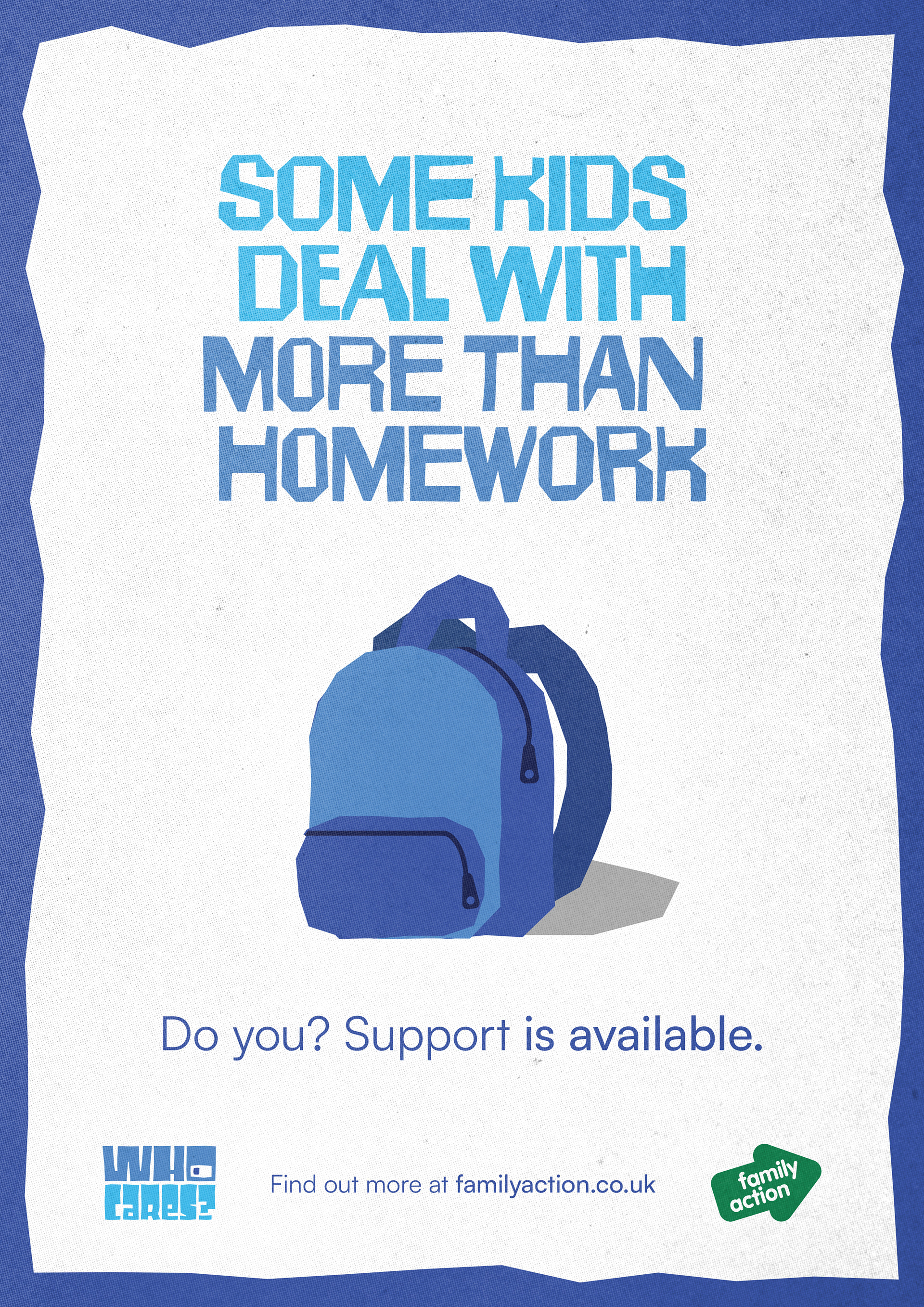
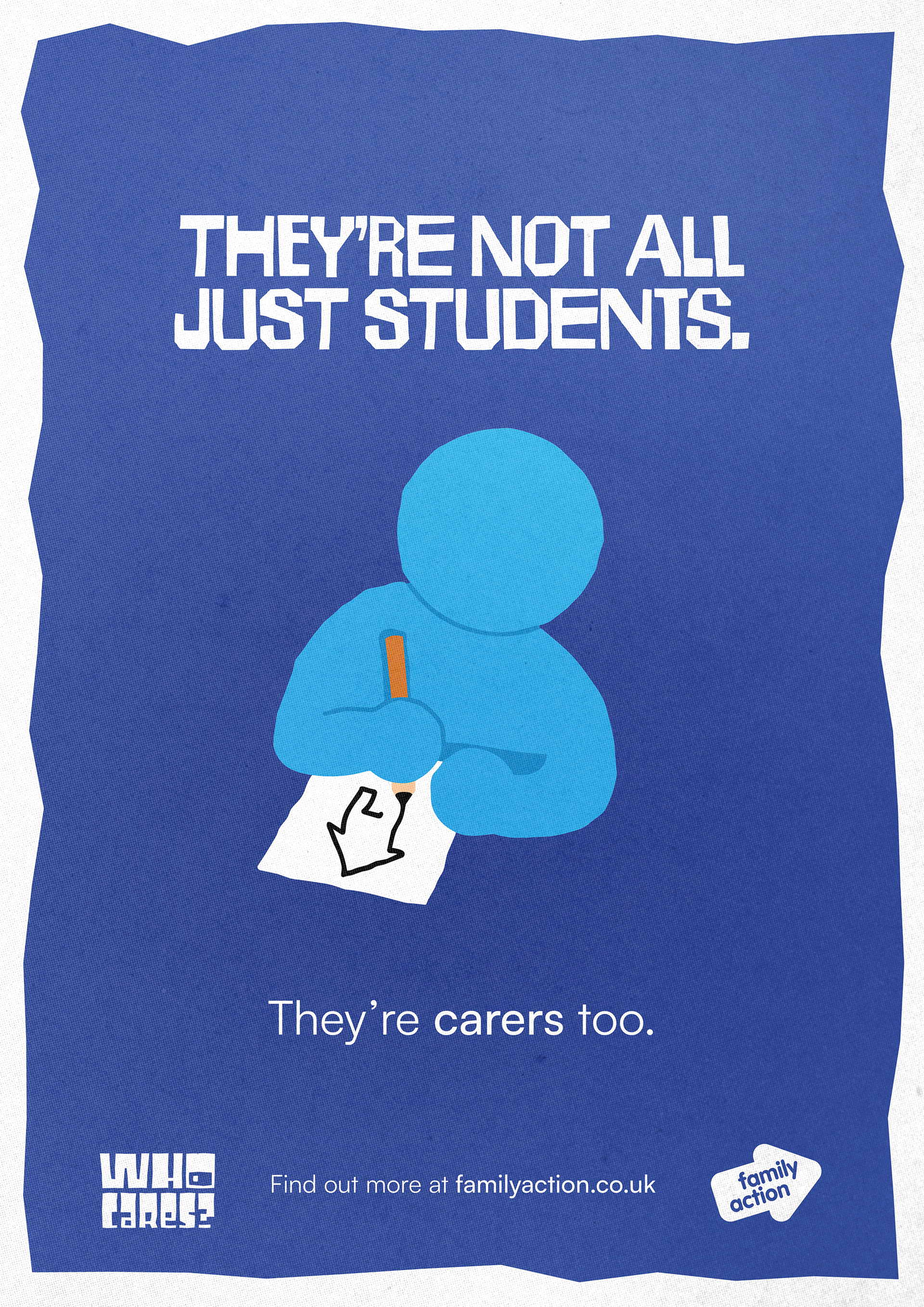
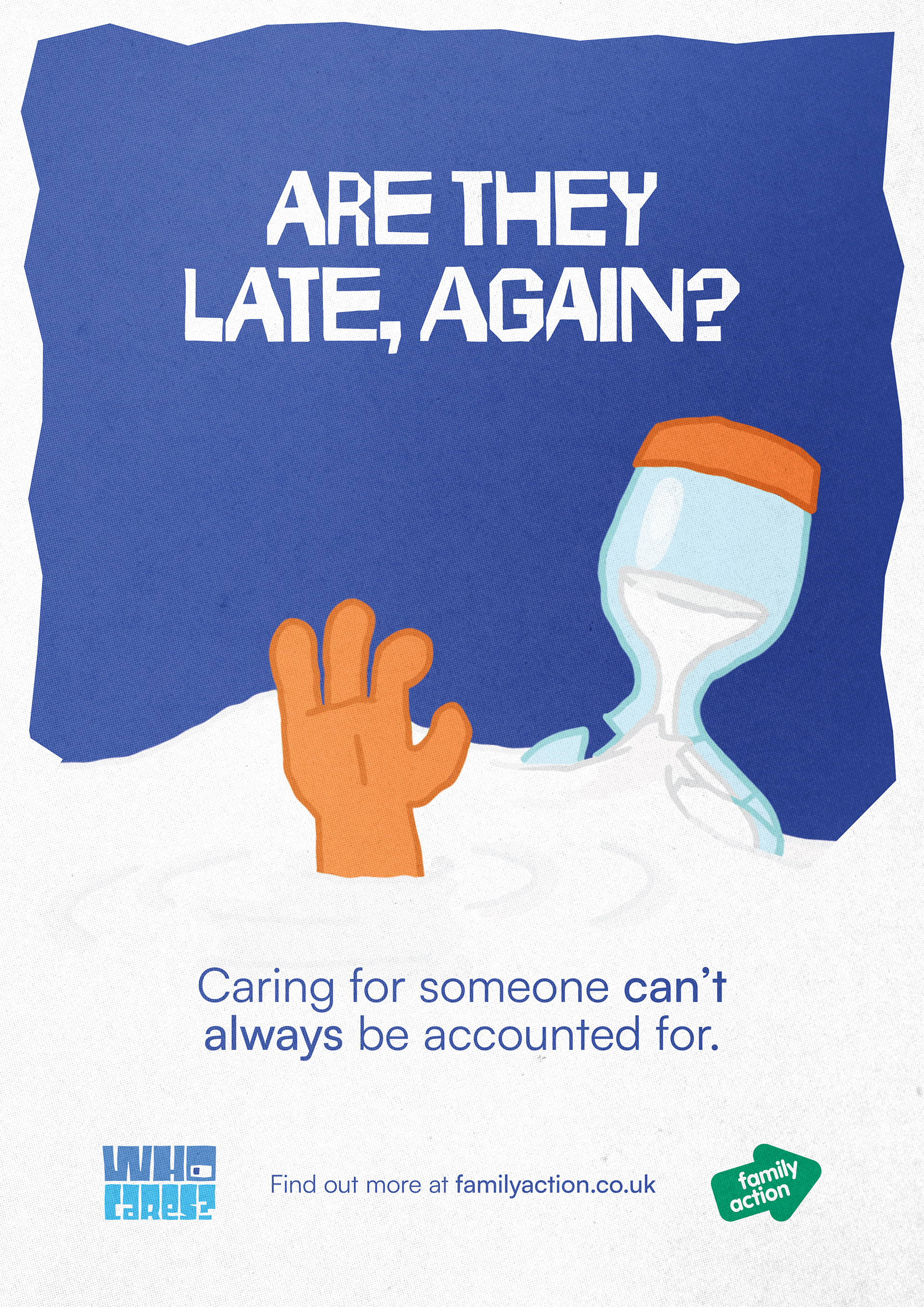
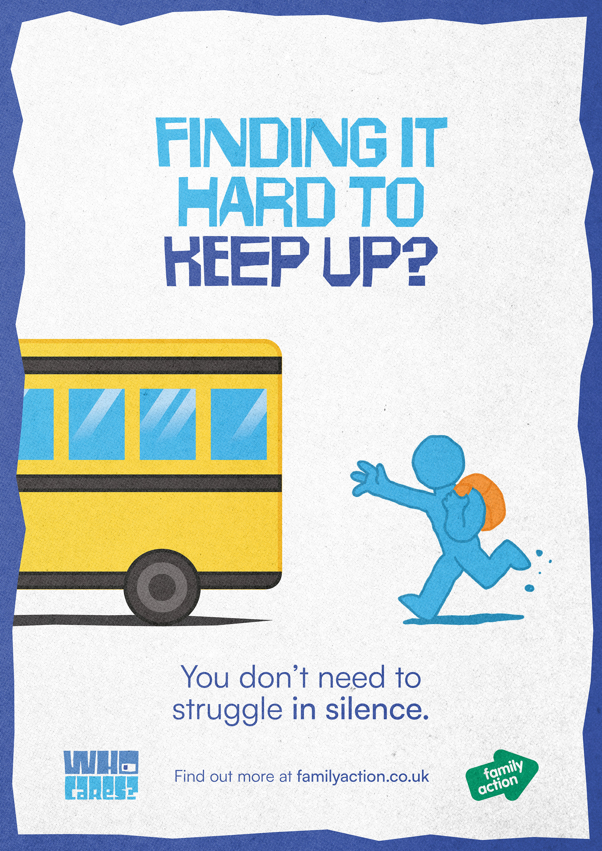
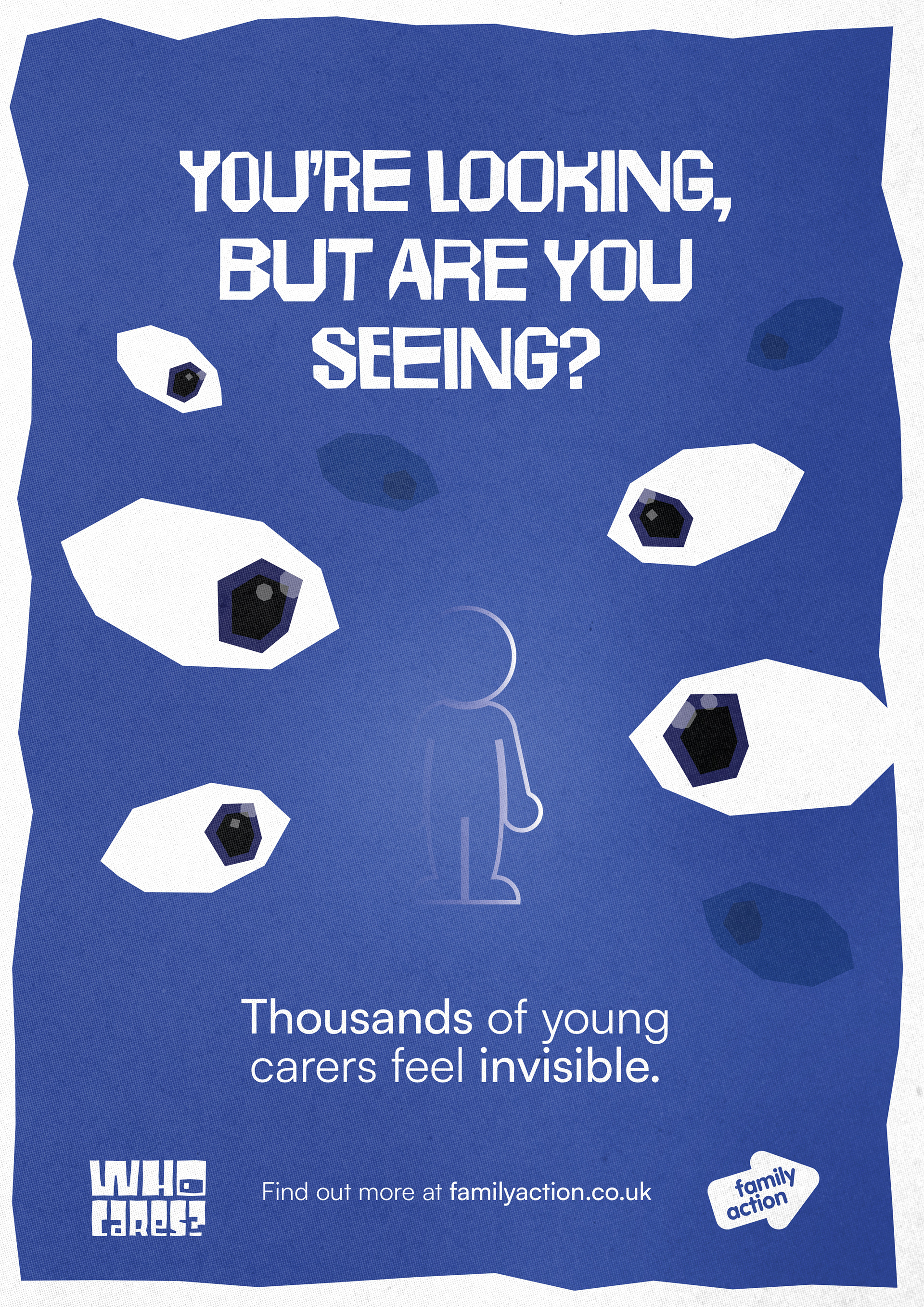
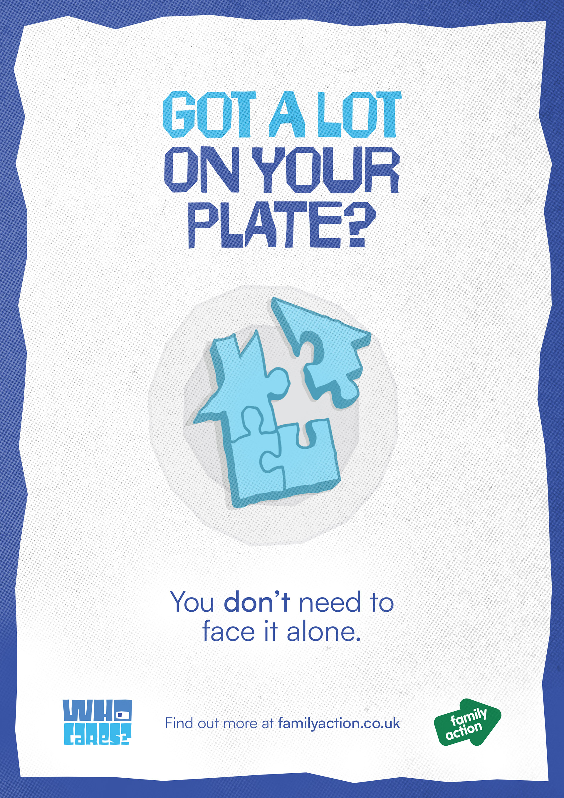
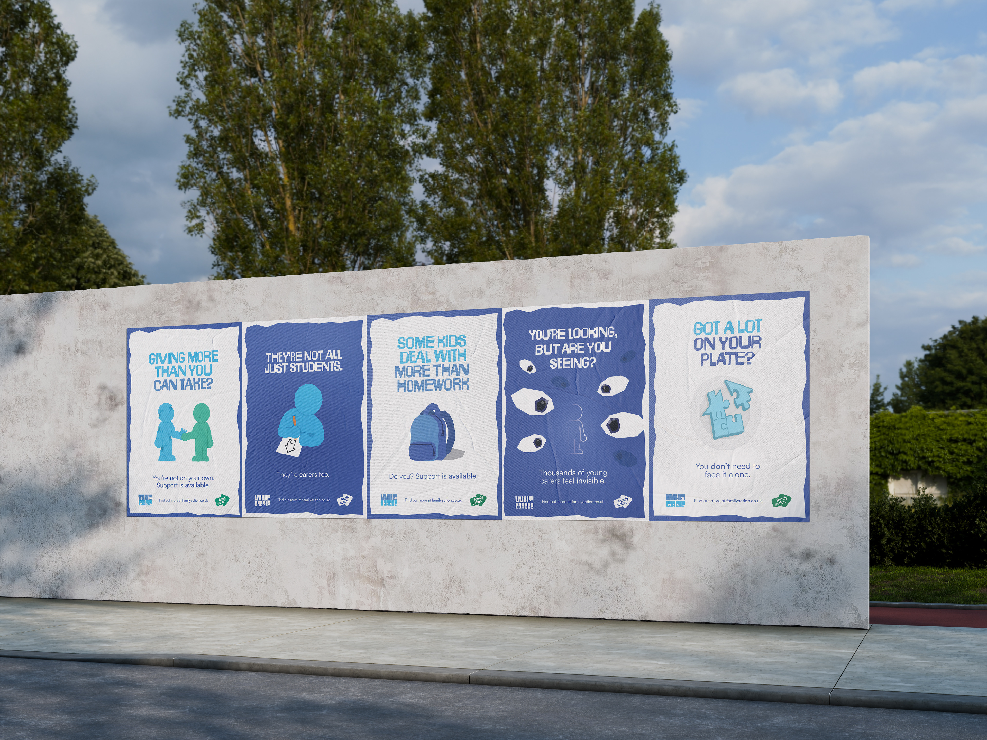
The campaign rolls out across three phases: an awareness phase that poses the Who Cares? question without immediately answering it; an education phase surfacing statistics and stories; and an action phase with direct calls to reach out or identify. Poster designs are split by background colour — white backgrounds address young carers directly, blue backgrounds address the institutions around them.
3. MOTION DESIGN
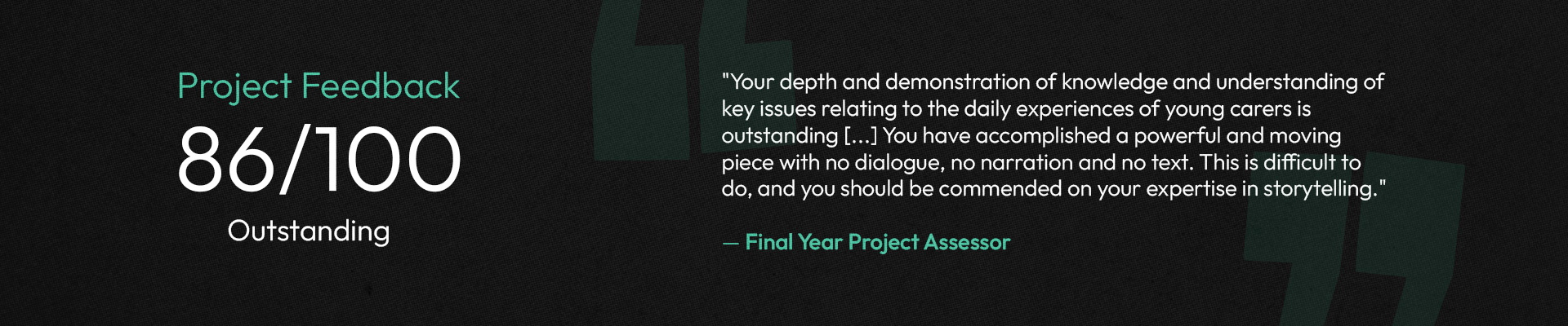
A 90-second motion design film — produced in After Effects with character rigging developed beyond the programme curriculum — builds its narrative entirely without dialogue, narration, or on-screen text. The puzzle piece motif traces the weight of a caregiving routine, before resolving through the arrival of external support. The animation was described by assessors as "a powerful and moving piece" that demonstrated "real expertise in storytelling."
4. CAMPAIGN MATERIALS
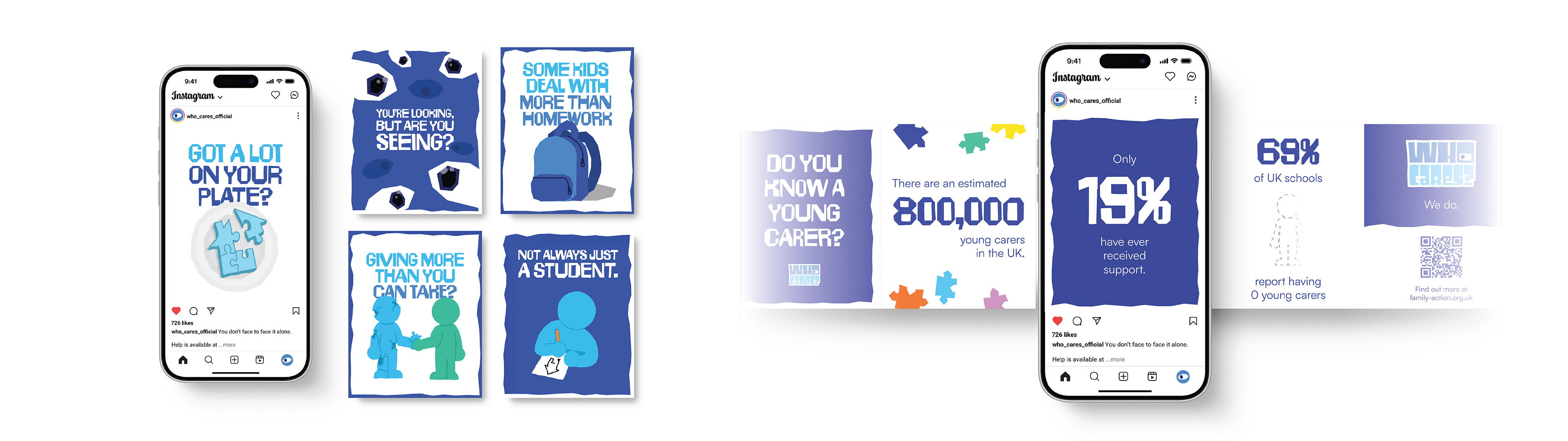
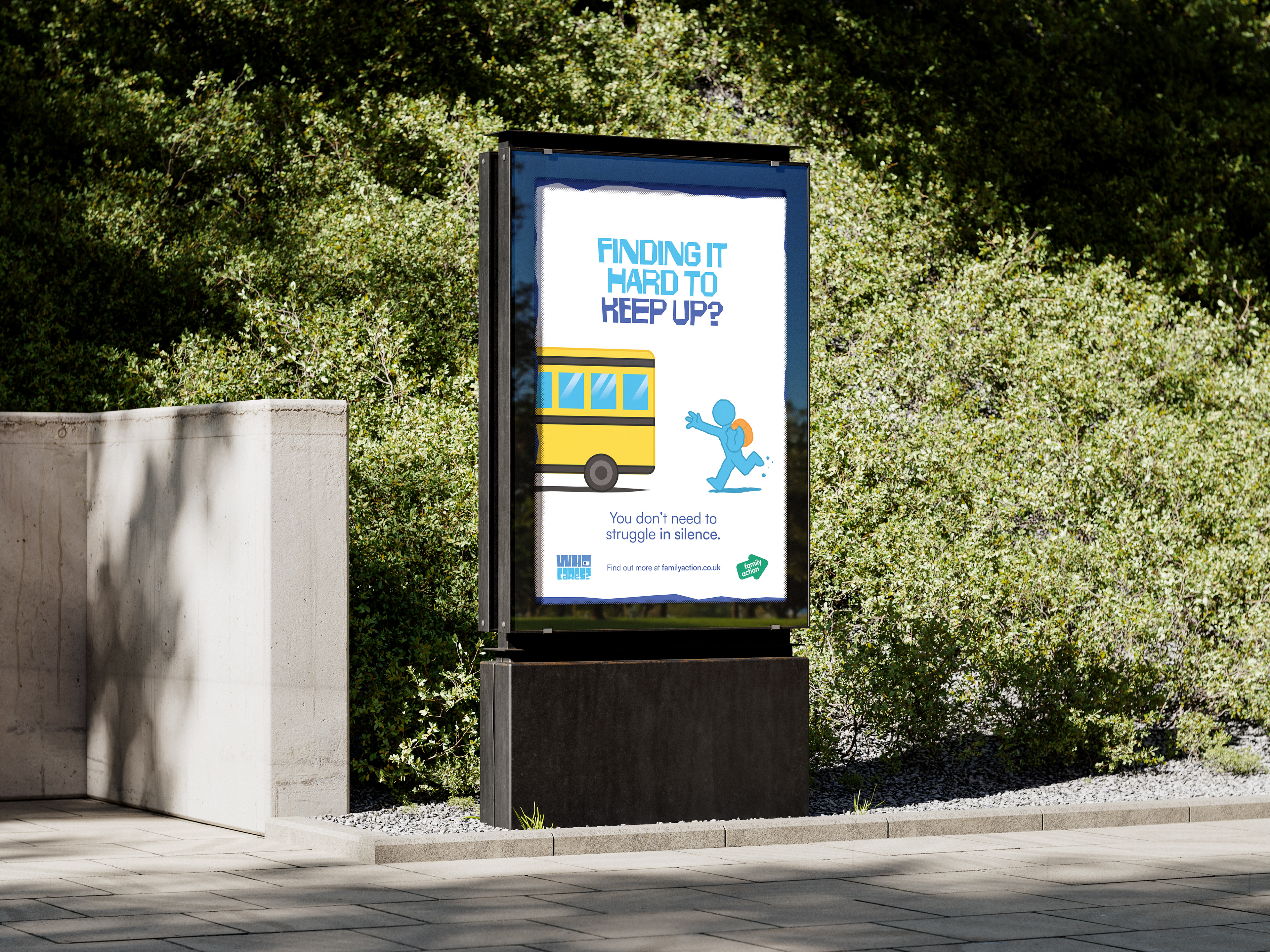
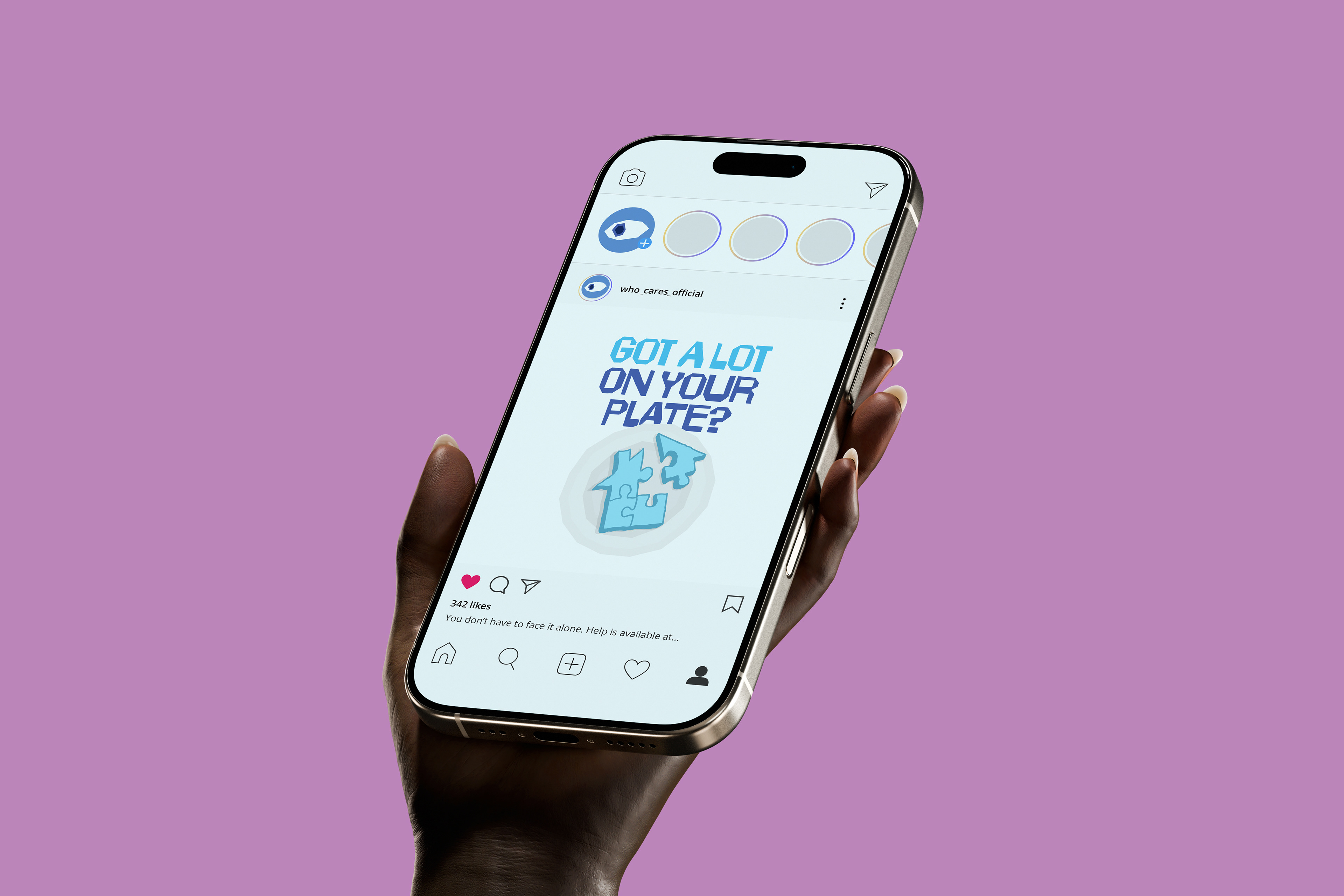
The full suite includes print posters (designed for schools, GP surgeries, and libraries), digital out-of-home formats for bus stops and transit advertising, social media assets for Instagram and TikTok, and a statistical carousel series directing audiences to familyaction.co.uk.

View more of my work:

Back to Top